I Want to Talk You Out of The Feature Wall

I'll be honest - I've been back and forth on feature walls myself - one of my old apartments definitely had a wall behind the dining table painted in Farrow & Ball's Brassica which was nowhere else - and there are sometimes inescapable, 'absolutely cannot carry the wallpaper across the whole room' instances when covering just one or perhaps two walls is the only option, but for the times when this is not the case - I have grown to really loathe a feature wall.

I think that they are just a compromise that nobody actually wanted. You fall for a colour, or a wallpaper that you know feels right and you can't stop thinking about, but committing to the whole room feels like too much, so you do one wall! One brave wall, three cautious ones, and end up with a room that never quite decides what it wants to be. So please let me gently talk you out of it, and show you where that courage is better spent.
The problem with picking one wall

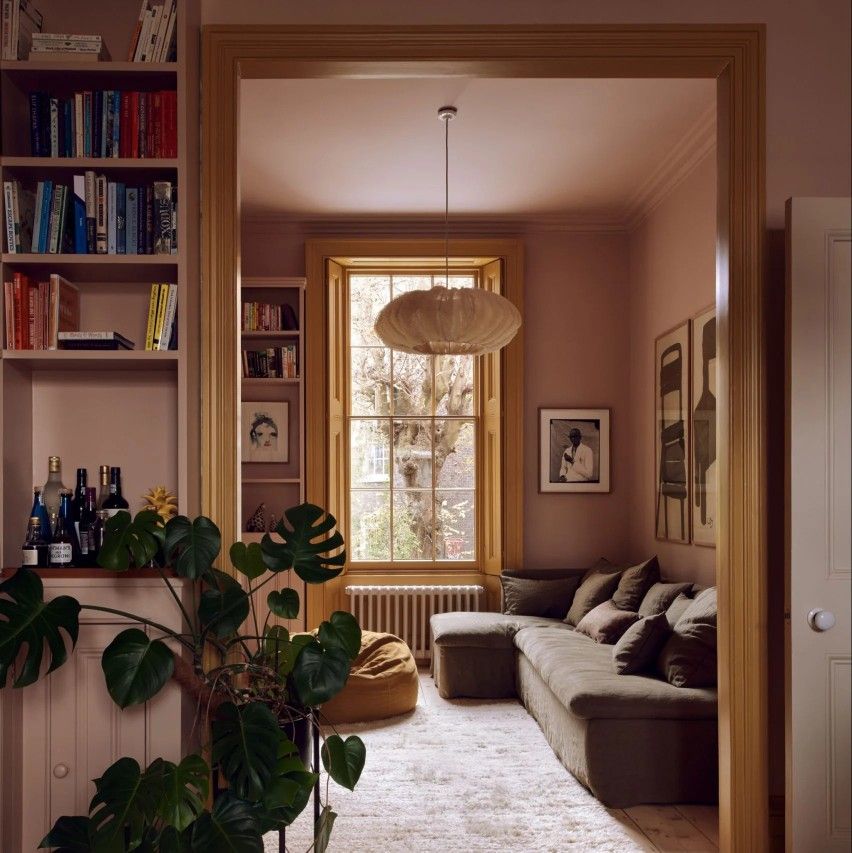
A single accent wall draws the eye to one flat plane and leaves the other three looking like they're waiting for something. Worse, the wall we tend to choose (behind the bed, behind the sofa) is rarely the one the architecture cares about. What you end up emphasising is a blank rectangle instead of the chimney breast, the alcoves, or the run of original cornicing. The room is then going to feel lopsided, and the eye will always notice this.

Colour-drench it instead

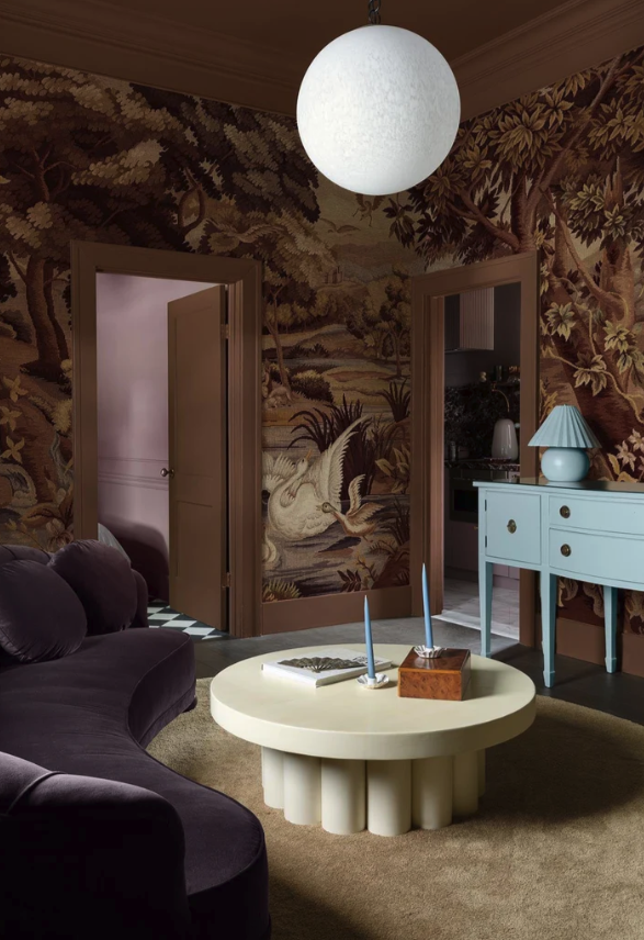
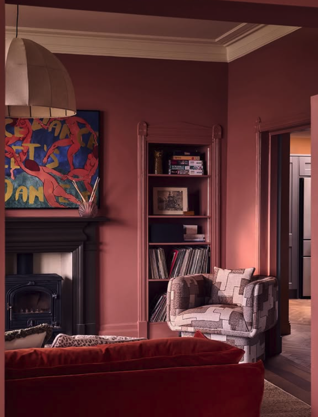
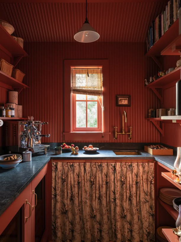
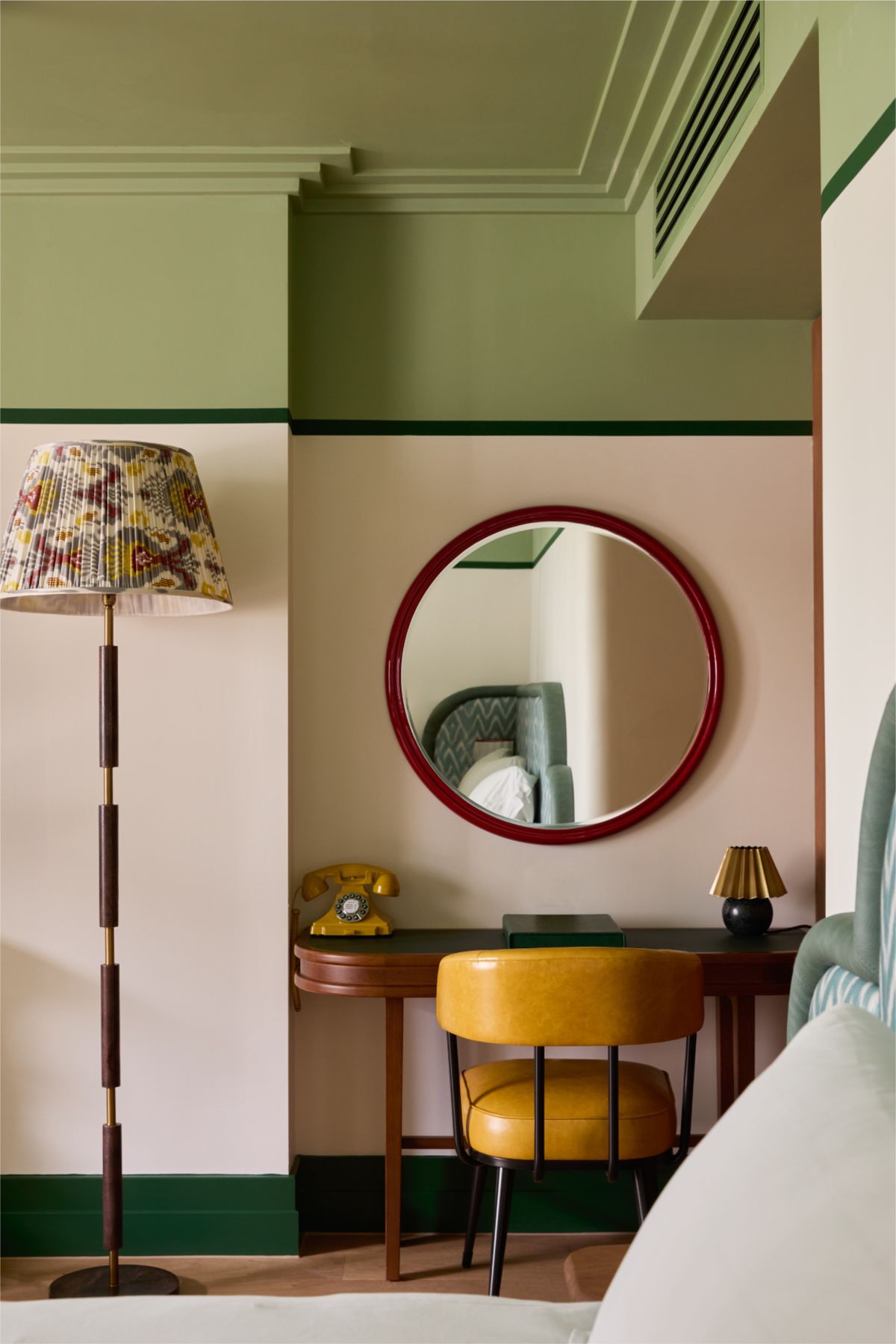
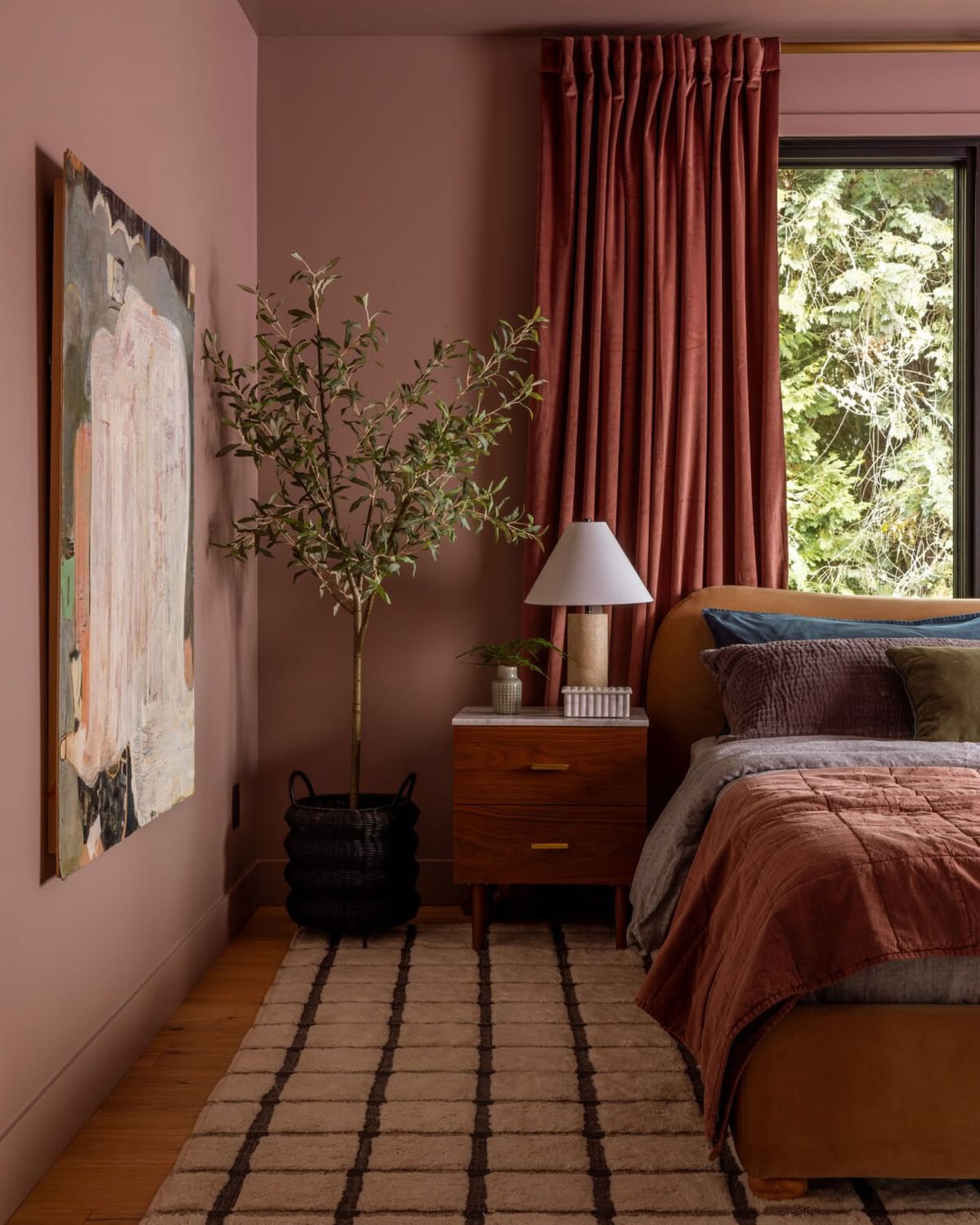
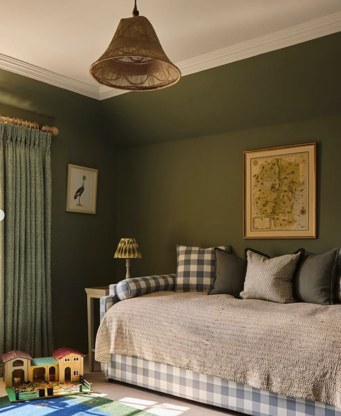
If you love the colour, use more of it, not less. Take it up the walls, over the trim, across the ceiling, and let the whole room sit inside one shade. It sounds bolder than a feature wall but actually it somehow comes out calmer, because there's no hard stop for your eye to snag on. A muted teal, deep green or a muddy plaster pink wrapped around an entire room feels enveloping and considered in a way that one painted wall never manages.

Or let the house tell you where to put the pattern

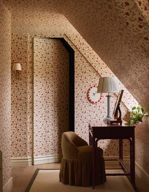
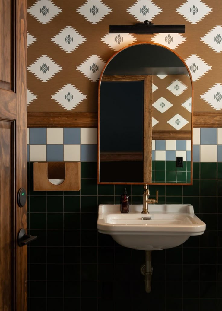
Wallpaper follows the same rule. If you’re not ready to do the whole room, then rather than just one arbitrary wall, paper the thing that's already a feature: the chimney breast and its alcoves as a set, above a dado rail in the hallway, or the inside of a cupboard for a small surprise. A Morris & Co. or Sandberg print earns its keep when it wraps something with architectural logic behind it, but if you only paper it onto one lonely wall, the same pattern looks like it's just run out.

Don't forget the fifth wall

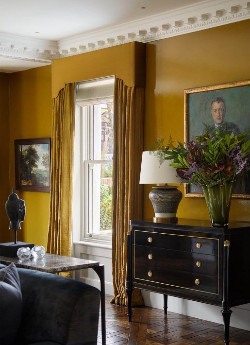
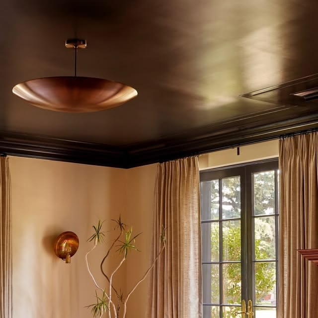
I think that the ceiling is the most overlooked surface in the house, and it's where a bit of nerve pays off most - why not do a darker ceiling and make it pop, or (as proposed) colour drench the whole space? Make sure you do take the ceiling colour over the cornicing rather than picking it out on its own, because a band of white along the top only chops the room off and shortens the wall. But if you do want the cornicing to show off a bit, a slightly lighter tone of the wall colour looks far more elegant than a hard contrast. And if you love a bit of drama, a high-gloss ceiling over matte walls throws the light around beautifully and is well worth the extra coats.

Dark or light? When to go either way

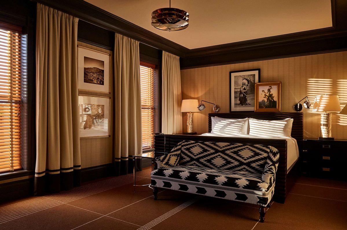
People ask me whether a room should go dark or light as though there's a rule, and there isn't - but there is a logic. Start with the light the room actually gets. A north-facing room takes cool light all day and can feel grey and flat if you fight it with brilliant white, so it usually loves a warm, deep colour to hold onto. A south-facing room is flooded with warm light and can carry cooler, paler shades without ever feeling cold. Then think about what you actually do in the room - a bedroom, a snug or a dining room you mostly use after dark are the places to go deep and enveloping, because they come alive by lamplight, while a kitchen or a family room you live in all day usually wants more light bouncing around.

And here's the bit people get backwards: a small, dark room is not a reason to reach for pale paint. A boxy north-facing room literally never feels bigger in white, it just feels like a small white room. Lean into it with a deep colour instead and it reads as intentional and cosy, rather than starved of the light it was never going to get.

The takeaway

Almost every time someone tells me they regret a decorating choice, it's the thing they played safe on, never the thing they were brave about. The feature wall was never too much colour - it was never quite enough commitment. So trust the colour enough to let it fill the room, because you'll live with it far longer than you spent choosing it, and the braver version is almost always the one you'd choose again.

If you've got a colour or a paper you keep coming back to but can't work out how far to take it, that's exactly what my Colour & Wallpaper Consultancy is for. Send me an email at hello@catrionahandsinteriors.com or book a discovery call, and we'll find the design you will feel joy everyday in, and won't second-guess.

WhatsApp Chat with me