

When it comes to interiors, colour has always been my most essential tool. From my earliest experiments to my current home and new clients, I’ve never used pure white or black. Instead, I strive to use colour artfully - sometimes with bold, statement-making shades and other times with quieter, subtle tones that reveal their complexity in different lights. I believe that choosing the right colour palette for your home is about embracing the unexpected while maintaining a sense of harmony. A truly inspiring palette doesn’t shy away from bold contrasts or unconventional pairings; instead, it thrives on them. Think about how a vibrant jewel tone might elevate a muted neutral, or how a metallic accent can bring depth and dimension to soft textures. Layering colours with varying intensities and finishes also helps create a sense of rhythm, making even the boldest combinations feel intentional and cohesive.
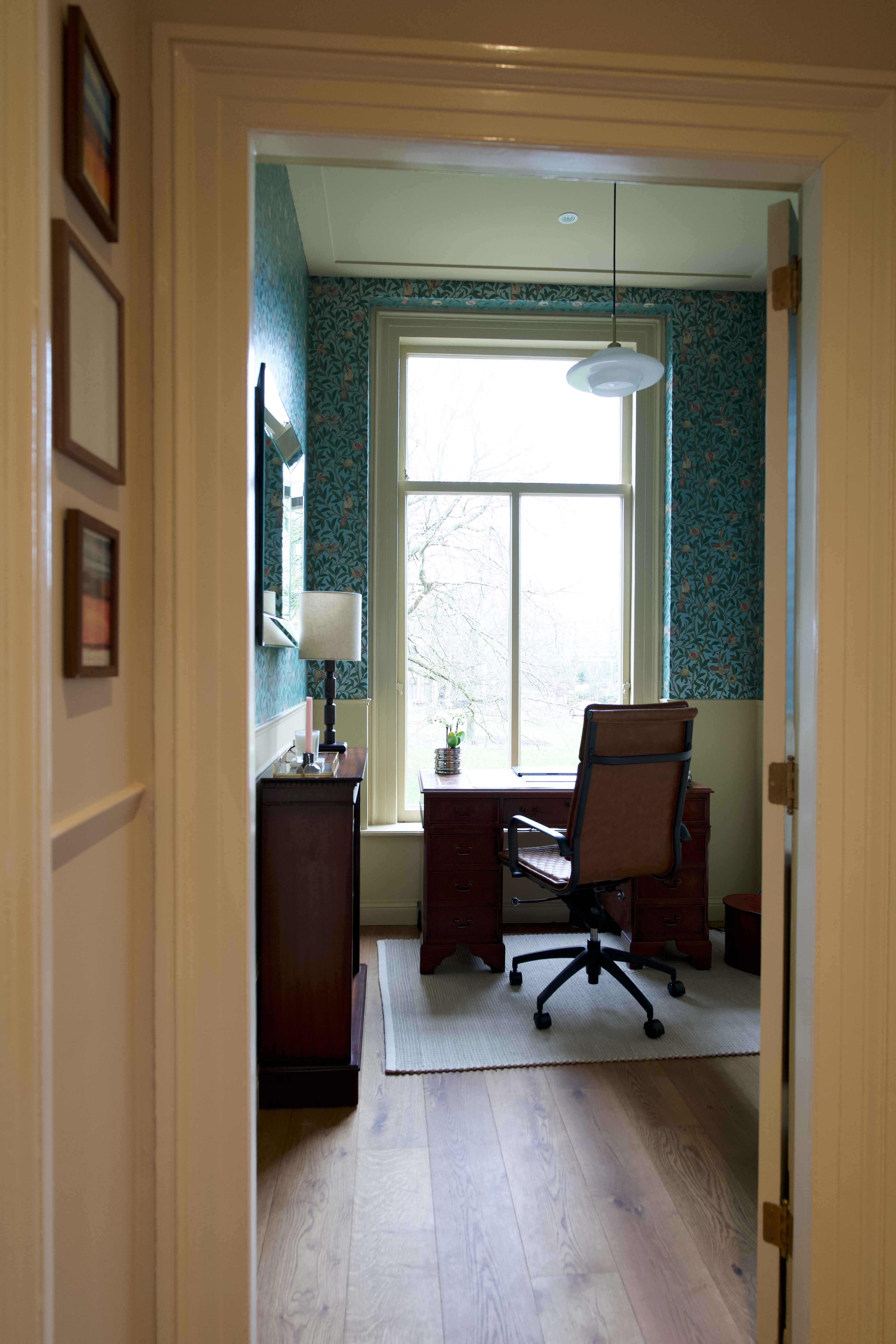
For my home, I embraced a neutral palette on many of the walls, creating a soft and inviting backdrop. But it’s the bolder choices that give the spaces their character - dark, moody greens or deep reds on the trim, jewel-toned furnishings, and layers of pattern and texture to elevate the entire scheme. This more muted approach allows each room to feel timeless yet full of personality, achieving a balance between restraint and flair.
Colour has a profound impact on our emotions and well-being, making it a key consideration in home design. Cool tones like blue and green evoke calmness and tranquillity, perfect for bedrooms or bathrooms. Warm tones, such as brown, red and orange, energise and can create a sense of cosiness in social spaces like living and dining rooms. By embracing the emotionality behind colours, you can create spaces that look beautiful but also support your desired mood and feeling in your home.



.jpeg)

